
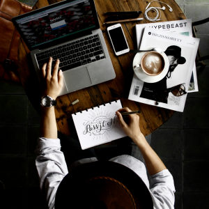
Typography is the art of arrangement of letters to create legible, appealing, and easily readable language.
Typography heavily involves different styles of fonts, appearances, and structure of aim to convey specific messages. Typography in its essence is used to bring the text to life. We are concerned with legibility, readability, and aesthetics. We aim to achieve excellence in all three.
The history of typography can be traced back to the 11th century when movable type was introduced. The design of typefaces has evolved with the constant evolution of typesetting systems thanks to the technological advances of modern-day society and science. Typography at its core is a vital component of the user interface as it establishes a well-built visual hierarchy and provides a balance graphically to the letters displayed. Although typography has evolved significantly from its origins, it is a largely conservative art that tends to cleave closely to tradition. Since digitization, typographical uses have spread to a wider range of applications, appearing on web pages, LCD mobile phone screens, and hand-held video games.
Regarding how people recognize words when they read, studies comparing Boauma recognition and parallel letter recognition, which is widely accepted by cognitive psychologists. Different periodicals design their publication, including their typography, to achieve a particular tone or style. For example, USA Today uses bold, colorful, and comparatively modern style through their use of a variety of typefaces and colors; type sizes vary widely, and the newspaper’s name is placed on a colored background. In contrast, The New York Times uses a more traditional approach, with fewer colors, less typeface variation, and more columns.
A Font for Developers
The screen-optimized Operator Mono ScreenSmart is designed for developers, to make code both easier to parse and more satisfying to write.
Sans Serif Symbols
In each of its ten weights, our Decimal family includes a set of 111 symbols for both annotating and illustrating.
Newly Expanded
Is any typeface more in-the-know than a Slab Serif? Our newly expanded Sentinel family includes twelve weights, small caps, and two sets of ornaments.
Italics Examined
Often the most expressive part of a type family, italics come in countless different species. Meet the Superitalic and Cursive Slab.
Plays Well With Others
A distinctive and companionable typeface, Idlewild can be approachable, earnest, bright, or cultivated, but always at home wherever it goes.
Compact Meets Chic
A family of stylish condensed typefaces, Peristyle is designed to restore the effortless chic of the high contrast sans
Robert Bringhurst, ‘The Elements Of Typography Style.’
“Typography is to literature as musical performance is to composition: an essential act of interpretation, full of endless opportunities for insight or obtuseness
Good typography should be used to enable the audience to be guided by the like of it and gather information from it.